
Steps to Author Tabs Component:
Step 1: Click on drag components here, and click on + icon to add the component on page.

Tabs Component





Steps to Author Tabs Component:
Step 1: Click on drag components here, and click on + icon to add the component on page.

Step 2: Search and select tabs component from dropdown list and then drag and drop it onto the desired location on the page.

Step 3: Click on the highlighted icon to configure the component.

Step 4: Author the tabs component as shown below.


Authoring Fields Variation1
| Authoring Field | Description |
| Choose Variation | It is a dropdown field with two values Variation 1 : If selected,tabs will display with some styling for healthhub and Variation 2 : If selected ,tabs will display with some different style used for buildeasy |
| Configure Tabs here | Multified with three fields 1.Tab title 2.Reference Key 3.Model Path |
| Tab Title | This fields is used to display the tabs title |
| Reference Key | It is a required field to uniquely identify the tabs |
| Modal Path | If author it will show the popup when we toggle between the tabs |
| Feedback Page Path | If author it will display the feedback button on the page |
| Therapuetic Area Name | It is used to get the data for the analytics team |
| Collapse all tabs content | If checked none of the tabs content will be shown upon page load |
| Display Mobile Tabs in Accordion View | Checkbox field by default this check box will be enabled, this will render the tabs in acoordion view for mobile layout. |
| Active Tab Background Color | Colorpicker field to select background color for active tab |
| Active Tab Title Color | Colorpicker field to select color for title |
| Non Active Tab Background Color | Colorpicker field to select background color for non active tab |
| Non-active Tab Title Color | Colorpicker field to select color for non active tab title. |
| Tab Height in px | Number filed to author tab height Insert a number for setting the height of Tab. Default, the max content height is set for all the tabs. |
| Tab border | Checkbox field If checked Tab border will be applied |


Authoring Fields Variation2
| Authoring Field | Description |
| Choose Variation | It is a dropdown field with two values Variation 1 : If selected,tabs will display with some styling and Variation 2 : If selected ,tabs will display with some different style |
| Configure Tabs here | Multified with three fields 1.Tab title 2.Reference Key 3.Model Path |
| Tab Title | This fields is used to display the tabs title |
| Reference Key | It is a required field to uniquely identify the tabs |
| Display Mobile Tabs in Accordion View | Checkbox field by default this check box will be enabled, this will render the tabs in acoordion view for mobile layout. |
| Active Tab Background Color | Colorpicker field to select background color for active tab |
| Active Tab Title Color | Colorpicker field to select color for title |
| Non Active Tab Background Color | Colorpicker field to select background color for non active tab |
| Non-active Tab Title Color | Colorpicker field to select color for non active tab title. |
| Tab Height in px | Number filed to author tab height Insert a number for setting the height of Tab. Default, the max content height is set for all the tabs. |
| Tab border | Checkbox field If checked Tab border will be applied |
After authoring the tabs component, to author content inside tabs
Ex: if content to be authored in the second tab, click on the preview mode as shown in the below example and select the tab on which the content to be authored

After selecting the tab, click on edit mode to author the components inside the tab
click on drag and drop component and add the required component as shown in the below example

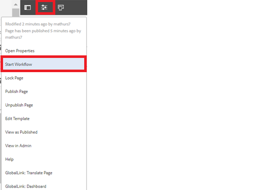
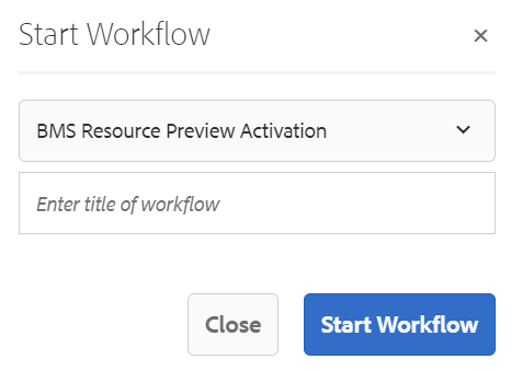
Step 5: After authoring all the fields, start workflow as shown below.
Example : Tabs Component Variation 1
Tabs Component V1 Variation
Example : Tabs Component Variation 2
Tabs Component V2 Variation Tab1 Diagnosis
Tabs Component V2 Variation Tab2 Treatment