
Step 1: Navigate to the page where you want to add the component. Click on "Drag components here" and click on + to add the component on page.
Accordion Component

Accordion Component





Step 1: Navigate to the page where you want to add the component. Click on "Drag components here" and click on + to add the component on page.

Step 2: Search and select accordion component from dropdown list and then drag and drop it onto the desired location on the page.

Step 3: Once the component is added, you can configure it by selecting configure icon as showcased in below image.

Step 4: In the component configuration dialog, you can author Display setting and content Tabs (Note: content tab will be available only for Variation 1)
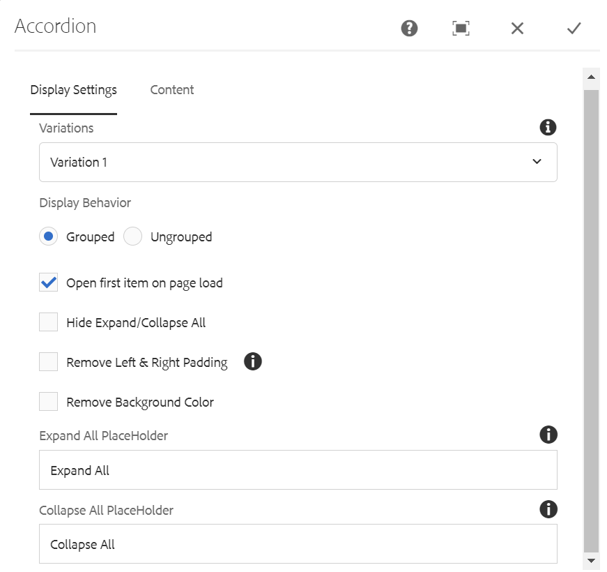
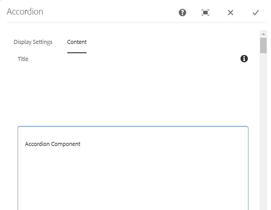

Authoring Fields - Variation 1
| Field name | Description |
| Display Settings tab | |
| Variation | Variation is a dropdown field with two different options.
|
| Display Behavior | Radio button field with two different options Grouped and Ungrouped |
| Open First item on page load | Checkbox field if enabled first item in the accordion will be opened on page load |
| Hide Expand/Collapse All | Checkbox field if enabled Expand and collapse all labels will be hidden |
| Remove Left & Right padding | Checkbox field if enabled padding for items won't be applied |
| Remove Background Color | Checkbox field if enabled background color will be removed |
| Expand All PlaceHolder | Placeholder text for Expand All Label |
| Collapse All PlaceHolder | Placeholder text for Collapse All Label |
| Content tab | |
| Title | This is a text authoring field to author the title text. Superscript, subscript, and footnotes are supported. |
| Add button | This add button is used for adding accordion elements. |


Authoring Fields
| Field name | Description |
| Accordion element | |
| Headline | This is a text authoring field to author the headline text for the element. Superscript, subscript, and footnotes are supported. |
| Content | This is a text authoring field to author the content text for the element. Footnotes, heading, link, unlink, bold, ordered list, unordered list, subscript, superscript are supported. |
| Image above | This is path authoring field to author image from dam. |
| Image above alt text | This is a text authoring field to author the alternate text for the image above. |
| Image below | This is path authoring field to author image from dam. |
| Image below alt text | This is a text authoring field to author the alternate text for the image below. |
Accordion Component - Variation 1

This is created by using Accordion Component
Content for the second element


Content for the third element

Authoring dialog for Accordion Component Variation2
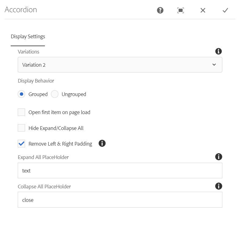
Authoring Fields - Variation 2
| Field name | Description |
| Display Settings tab | |
| Variation | Variation is a dropdown field with two different options.
|
| Display Behavior | Radio button field with two different options Grouped and Ungrouped |
| Open First item on page load | Checkbox field if enabled first item in the accordion will be opened on page load |
| Hide Expand/Collapse All | Checkbox field if enabled Expand and collapse all labels will be hidden |
| Remove Left & Right Padding | Checkbox field if enabled padding for items won't be applied |
| Expand All PlaceHolder | Placeholder text for Expand All Label |
| Collapse All PlaceHolder | Placeholder text for Collapse All Label |
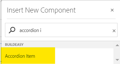
Step 5:Add Accordion item inside accordion component for variation 2 Search and select accordion item from dropdown list and then drag and drop it onto the page.
Step 6:Click on "Drag components here" and click on + inside accordion item to add selected components(Ex:Rich text , Image Components).
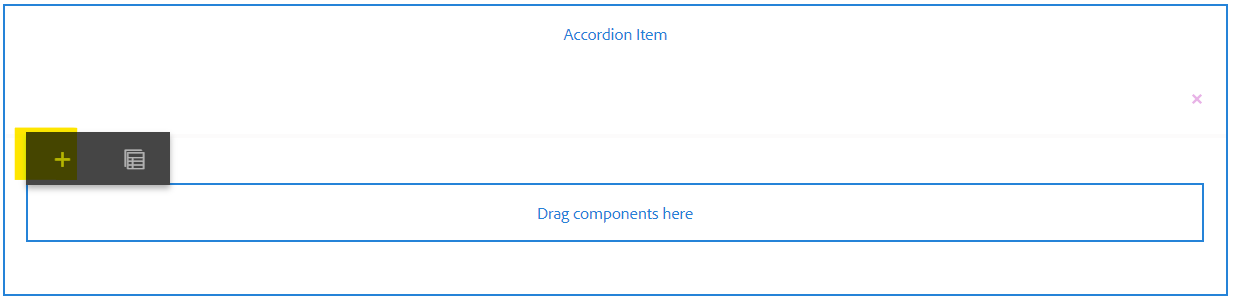
Authoring Dialog fields for Accordion Item
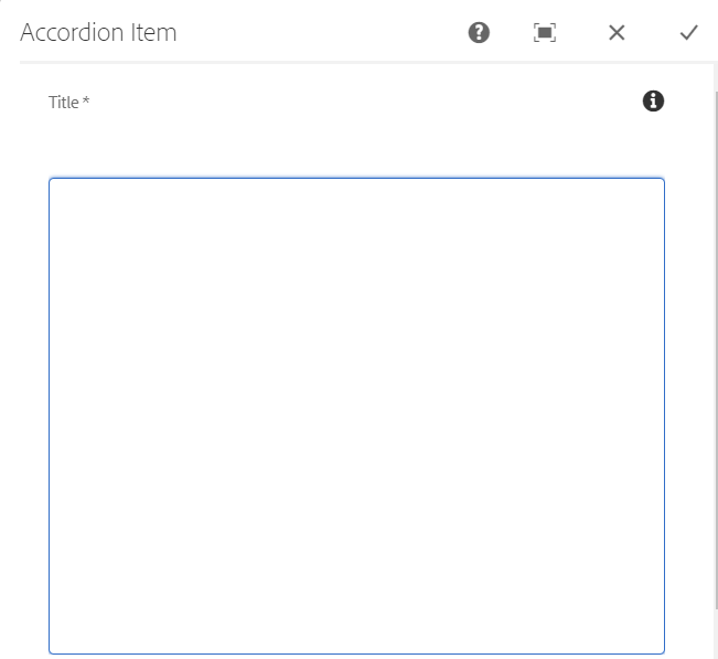

Authoring Fields - Accordion Item
| Field name | Description |
| Title | This is a text authoring field to author the Title text for the element. Superscript, subscript, Italic and Special Characters are supported |
| Anchor Name | This is a text authoring field to author the Ancor Name text for the element. |
| Expand/Collapse Icon | Drop Down field with two different options Chevron: Plus |
| Position of Icon | Drop Down field with two different options to display the icon position Right Left |
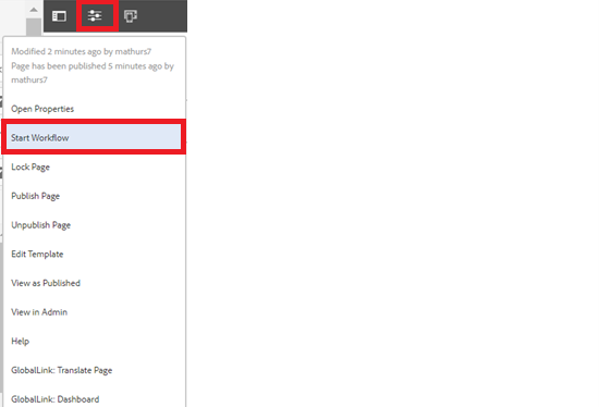
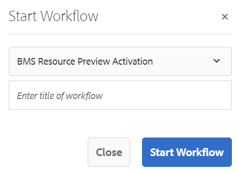
Step 7: After authoring all the fields, publish the page as shown below.
Accordion Component - Variation 2
This is created by using Accordion Component
Bristol Myers Squibb had a global exclusive license to develop, manufacture and commercialize Rockefeller University’s novel monoclonal antibody (“mAb”) duo treatment that neutralizes the SARS-CoV-2 virus for therapy or prevention of COVID-19.
Last updated: September 13, 2023
