
Step 1: Navigate to the page where you want to add the component. Click on "Drag components here" and click on + to add the component on page.
Cards Component

Cards Component





Step 1: Navigate to the page where you want to add the component. Click on "Drag components here" and click on + to add the component on page.

Step 2: Search and select cards component from dropdown list and then drag and drop it onto the desired location on the page.

Step 3: Once the component is added, you can configure it by selecting configure icon as showcased in below image.

Step 4: In the component configuration dialog, you can author the Settings, Selection, Filter, and Cards tabs.
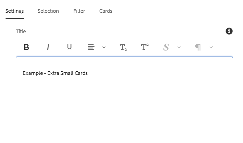


Authoring Fields: Settings Tab
| Fields | Description |
| Settings tab | |
| Title | This is a text authoring field to author the title text. Bold, Italic, Underline, Lists, Superscript, subscript, and footnotes are supported. |
| Filter Results Label |
This is a text authoring field to author the filter results label text. (Note: Entered text should be displayed on the filter results label. If the text is not entered by user it should display the Ergebnisse filtern as a default text. |
| Remove Margin | Checkbox field if enabled margin from left and right will be removed inorder to occupy full width |
| Layout | Layout of the cards are available in 10 variations:
|
| Limit displayed cards | Select the number of cards to be displayed in result; a numeric value has to authored. |
| Only display manually placed cards | Check this to display only manually authored pages/assets as cards authored under Cards tab -> Card paths section. |
| Sort by | Sorting is available as two options:
Note: Cards Sorting will be done considering the following
|
| Show Video/Card Read Time | Checkbox field if enabled, displays card read time which can either be video duration or page read time. |
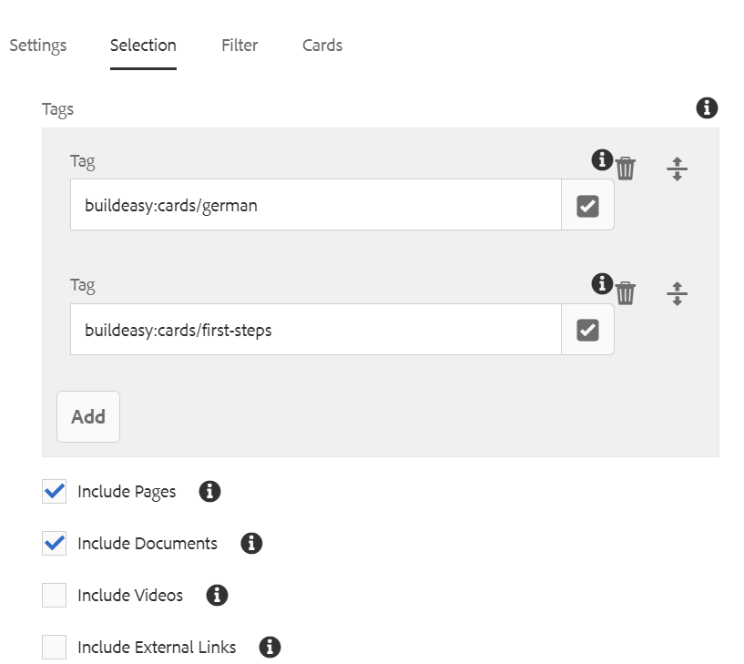
Authoring Fields: Selection Tab
| Fields | Description |
| Selection Tab | |
| Tags | Add a tag - pages/documents containing this tag will be included in the resulting cards. |
| Include pages | Check this to include pages in the resulting cards. |
| Include documents | Check this to include documents in the resulting cards. |
| Include Videos | Check this to include Videos in the resulting cards. |
| Incluse External Links | Check this to include External links in the resulting cards. |

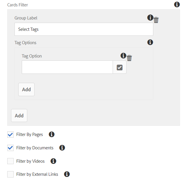
Authoring Fields: Filter Tab
| Fields | Description |
| Filter | |
| Group label | This is a text authoring field to author the group label text. |
| Tag option | Add to tag in filter for filtering pages/documents based on this tag. |
| Filter by pages | When checked pages will be included in result and displayed as cards. |
| Filter by documents | When checked documents will be included in result and displayed as cards. |
| Filter by Videos | When checked videos will be included in result and displayed as cards. |
| Filter by External Links | When checked External links will be included in result and displayed as cards. |
For adding Internal Link URLs or Paths in Card Path please use any one of the following approaches:


Authoring Fields: Cards Tab
| Fields | Description |
| Cards | |
| Card Path | Add path of page/document that needs to be displayed in the resulting cards. |
| External Links | |
| Name | This is a text authoring field to author the name text for the external link. |
| Image | Path authoring field to author image from dam. |
| Image alt text | This is a text authoring field to author the alternative text for the image. |
| Link | This is a path authoring field to author the link that needs to be redirected on click of the card. |
| Excerpt | This is a text authoring field to author the excerpt text for the link. |
Note: If Experience fragment need to be displayed as a cards, Please configure the experience fragment path in card path field
To create Experience fragment Please follw the steps mention in below page
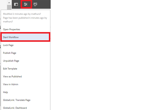
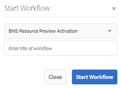
Step 5: After authoring all the fields, start workflow as shown below.
Example - Small Cards