





Intake Form
Intake Form
Intake Form
Intake Form
Intake Form

Step 1: Authoring Button Component

To use ChatBot, script should be authored at Brand page properties ChatBot HeadScripts field Click here for more information, Script will be provided by PUB team.

Script will support two chatbot types

  • 1.ARMChatbot 
  • 2.HCPChatbot

Once the script is updated, Button component should be authored in the page.

Navigate to the page where you want to add the component. Click on "Drag components here" and click on + to add the component on page. 

Step 2: Search and select button component from drop-down list and then drag and drop it onto the page.

Step 3: Once the component is added, you can configure it by selecting configure icon as showcased in below image.

Step 4: In the component configuration dialog,  Author the required fields

Authoring Field's : 

Authoring Field name Description
Button text This is a text authoring field to author text label for Button.
Button Link This is a pathbrowser field to author the link for button
(Note: If button should work as a redirect link author this field)
Button width This is a  number field to author width of the button to be displayed on the page
Button Font Size This is a number field to author font size in px
Sticky button This is a chekcbox field if enabled button will be stick to page 
(Note: Button Position and Button Position From The Top fields will be enabled only when sticky button enabled)
Button Position

This is a radio button with two different options

  •  Left  If checked button will be sticked to left side of the page
  • Right If checked button will be sticked to right side of the page
Button Position From The Top This is a number field to author the position of the button to be displayed from the top 
Button Text Color This is a color picker field authord color will be applied to text of the button
Button Background Color This is a color picker field authord color will be applied to background of the button
Button radius This is a number field to author the radius of the button 
Ex:0px 0px 0px 0px   
Button Inner Padding This is a number field to author inner padding of the button 
Ex: 15px 15px 15px 15px   
Button Border  
Border width This is a number field to author border width of the button
Border color This is a color picker field to author border color for the button
Button hover  
Hover text color This is a clolor picker field authored color will be applied to button text on hover.
Hover color This is a clolor picker field authored color will be applied to button on hover over button.
Button Icon Path This is a pathbrowser field to author image from dam to display icon on button
Icon Position This is a radio button to choose the position of icon either in left/right 
Button Orientation This is a radio button field to choose the orientation of the button ie: vertical/Horizontal
Button Onclick Functionalty This is a text authoring field to author the type of chatbot to be displayed on the page.
(Note: These are specific names that will  be provided by pub team as per the script) Ex: accessSupportARMChatController.openConverse(this, false)
Button Onclick Functionalty For Mobile and Tablet This is a text authoring field to author the type of chatbot to be displayed on the page for mobile view.
(Note: These are specific names that will  be provided by pub team as per the script) Ex:accessSupportARMChatController.openConverse(this, true)
Button Chat Controller ID

This is a text authoring field to author chat controller id
(Note: We are handling with two ID's 

  • chatbot1 - if authored HCP chatbot will be displayed
  • chatbot2 - if authored ARM chatbot will be displayed)


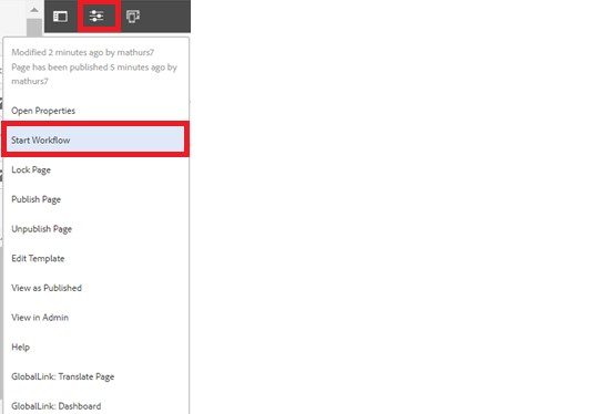
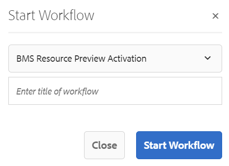
Step 5: After authoring all the fields, start workflow as shown below.

  • Select BMS Resource Preview Activation from the dropdown.
  • We can select appropriate title for the workflow and click on start workflow.
  • This will publish the page in preview environment and reviewers can review the page in preview instance.

Desktop View: