
Step 1: To author header component we need to configure this component on locale page.
Header Component

Header Component





The Header Component will contain the main image on the top of your page, the hero image.
Step 1: To author header component we need to configure this component on locale page.
Step 2: Access the content tree from left navigation as shown, select the configure icon corresponding to the header component, and click on configure icon.

Step 3: Author these mentioned fields for V1 Variation—header logo, logo alt text, and link path—in locale page.

| Authoring Field | Description |
| Variation | Variation is the dropdown field with two different options Variation 1 - If selected user will able to see logo,alt text and link fields Variation 2 - If selected user will able to see logo,alt text,link,pretitle lable,pretitle path fields and Header Navigation Links multifield for primary and secondary navigation |
| Logo | Add logo image for header from assets dam. Recommended Image Resolution - 250px x 65px |
| Alt Text | Alternate text can be authored in this field for logo. If link will be authored, aria-label will take precedence. |
| Link | Link path of the page can be added to, which user should redirect to on clicking the logo image. |
(Note: To Overrider header rendering from locale page, Navigate to page properties and author override header field with experience fragment path under Buildeasy Site Settings Tab. For more information Click here) to create Experience Fragments Click here to see reference.
Author these mentioned fields for V2 Variation


Authoring Fields V2 Variation
| Authoring Field | Description |
| Variation | Variation is the dropdown field with two different options Variation 1 - If selected user will able to see logo,alt text and link fields Variation 2 - If selected user will able to see logo,alt text,link,pretitle lable,pretitle path fields and Header Navigation Links multifield for primary and secondary navigation |
| Logo | Add logo image for header from assets dam. Recommended Image Resolution - 250px x 65px |
| Alt Text | Alternate text can be authored in this field for logo. If link will be authored, aria-label will take precedence. |
| Link | Link path of the page can be added to, which user should redirect to on clicking the logo image. |
| Open logo in new tan | This the checkbox for logo. If checked and user will click on logo then the page will open in new tab. |
| Header Navigation Links | This is the multifield and used to add primary and secondry navigation fot header. |
| Link Type | This is a dropdown field with two values Primary Link: If selected user will able to author primary navtigation links Secondary Links : If selected user will able to author secondary navigation links
|
| Primary Link | This is the path fields where user can author the page urls |
| Navigation Title | This is the title field under secondary navigation,user will able to add title for secodary links |
| Sub Navigation Links | This is the multifield for secondary navigation |
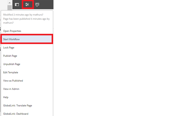
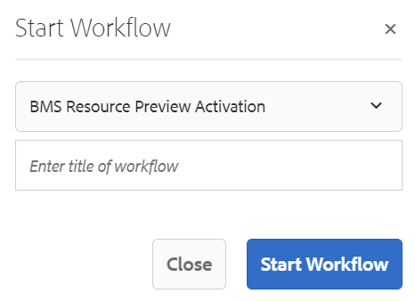
Step 4 : After authoring all the fields, start workflow as shown below.
Desktop View:

Example : Header Component V2 Variation
