
Step 1: Navigate to the page where you want to add the component. Click on "Drag components here" and click on + to add the component on page.
Carousel component

Carousel component





Step 1: Navigate to the page where you want to add the component. Click on "Drag components here" and click on + to add the component on page.

Step 2: Search and select Hero Banner Swiper component from dropdown list and then drag and drop it onto the desired location on the page.

Step 3: Once the component is added, you can configure it by selecting configure icon as showcased in below image.

Step 4: In the component configuration dialog author the required fields


Authoring Fields
| Field name | Description |
| View 7 | |
| Carousel View | This is a drop down field with with seven different options (Note: The view selected in hero banner swiper component will only be displayed inside swiper carousel item component) |
| Automatically transition slide | This is a check box field, If enabled automatically transition between slides will happen. |
| Transition Delay | This is number field to set the transition delay of slides in milliseconds |
| Enable Play And Pause | This is a check box field, If checked,enables play and pause option for the carousel when autoplay is enabled. |
| Hide Controls | If checked, disables controls for the carousel |
| Disable Touch | If checked, disables touch events (click and drag to change slides) |
| Previous Button Aria label | This is a text field to author aria Label for previous button. |
| Next Button Aria label | This is a text field to author aria Label for Nextbutton. |
| Margin Top Desktop | This is a number field to author a number for margin-top for desktop |
| Margin Top Mobile | This is a number field to author a number for margin-top for Mobile |
| Select aspect ratio for desktop | Drop down filed with four different options 16:9 2:1 4:3 1:1 |
| Select aspect ratio for mobile: | Drop down filed with four different options 16:9 2:1 4:3 1:1 |

Authoring Fields
| Field name | Description |
| View 1 | |
| Carousel View | This is a drop down field with with seven different options (Note: The view selected in hero banner swiper component will only be displayed inside swiper carousel item component) |
| Automatically transition slide | This is a check box field, If enabled automatically transition between slides will happen. |
| Transition Delay | This is number field to set the transition delay of slides in milliseconds |
| Enable Play And Pause | This is a check box field, If checked,enables play and pause option for the carousel when autoplay is enabled. |
| Hide Controls | If checked, disables controls for the carousel |
| Disable Touch | If checked, disables touch events (click and drag to change slides) |
| Brightcove Account | Text authoring field to author Account ID for brightcove video |
| Video Aspect Ratio | Text authoring field to author Aspect ratio of the video in the modal pop up (in the format of width/height eg: 12/5). |
| Previous Button Aria label | This is a text field to author aria Label for previous button. |
| Next Button Aria label | This is a text field to author aria Label for Nextbutton. |

Authoring Fields
| Field name | Description |
| View 2 | |
| Carousel View | This is a drop down field with with seven different options (Note: The view selected in hero banner swiper component will only be displayed inside swiper carousel item component) |
| Automatically transition slide | This is a check box field, If enabled automatically transition between slides will happen. |
| Transition Delay | This is number field to set the transition delay of slides in milliseconds |
| Enable Play And Pause | This is a check box field, If checked,enables play and pause option for the carousel when autoplay is enabled. |
| Hide Controls | If checked, disables controls for the carousel |
| Disable Touch | If checked, disables touch events (click and drag to change slides) |
| Enable Fraction Pagination | Checkbox field, If checked, fraction pagination will be enabled for the carousel and dots are hidden. |
| Previous Button Aria label | This is a text field to author aria Label for previous button. |
| Next Button Aria label | This is a text field to author aria Label for Nextbutton. |

Authoring Fields
| Field name | Description |
| View 3 | |
| Carousel View | This is a drop down field with with seven different options (Note: The view selected in hero banner swiper component will only be displayed inside swiper carousel item component) |
| Automatically transition slide | This is a check box field, If enabled automatically transition between slides will happen. |
| Transition Delay | This is number field to set the transition delay of slides in milliseconds |
| Enable Play And Pause | This is a check box field, If checked,enables play and pause option for the carousel when autoplay is enabled. |
| Hide Controls | If checked, disables controls for the carousel |
| Disable Touch | If checked, disables touch events (click and drag to change slides) |
| Brightcove Account | Text authoring field to author Account ID for brightcove video |
| Video Aspect Ratio | Text authoring field to author Aspect ratio of the video in the modal pop up (in the format of width/height eg: 12/5). |
| Previous Button Aria label | This is a text field to author aria Label for previous button. |
| Next Button Aria label | This is a text field to author aria Label for Nextbutton. |

Authoring Fields
| Field name | Description |
| View 4 | |
| Previous Button Aria label | This is a text field to author aria Label for previous button. |
| Next Button Aria label | This is a text field to author aria Label for Nextbutton. |

Authoring Fields
| Field name | Description |
| View 5 | |
| Carousel View | This is a drop down field with with seven different options (Note: The view selected in hero banner swiper component will only be displayed inside swiper carousel item component) |
| Automatically transition slide | This is a check box field, If enabled automatically transition between slides will happen. |
| Transition Delay | This is number field to set the transition delay of slides in milliseconds |
| Hide Controls | If checked, disables controls for the carousel |
| Disable Touch | If checked, disables touch events (click and drag to change slides) |
| Previous Button Aria label | This is a text field to author aria Label for previous button. |
| Next Button Aria label | This is a text field to author aria Label for Nextbutton. |

Authoring Fields
| Field name | Description |
| View 6 | |
| Carousel View | This is a drop down field with with seven different options (Note: The view selected in hero banner swiper component will only be displayed inside swiper carousel item component) |
| Automatically transition slide | This is a check box field, If enabled automatically transition between slides will happen. |
| Transition Delay | This is number field to set the transition delay of slides in milliseconds |
| Enable Play And Pause | This is a check box field, If checked,enables play and pause option for the carousel when autoplay is enabled. |
| Hide Controls | If checked, disables controls for the carousel |
| Disable Touch | If checked, disables touch events (click and drag to change slides) |
| Brightcove Account | Text authoring field to author Account ID for brightcove video |
| Video Aspect Ratio | Text authoring field to author Aspect ratio of the video in the modal pop up (in the format of width/height eg: 12/5). |
| Previous Button Aria label | This is a text field to author aria Label for previous button. |
| Next Button Aria label | This is a text field to author aria Label for Nextbutton. |
Step 5:Add Swiper carousel item inside Hero banner swiper component
Search and select Swiper carousel item from dropdown list and then drag and drop it onto the page.

Step 6:Once the component is added, you can configure it by selecting configure icon as showcased in below image

Authoring Dialog fields for swiper carousel item


Authoring Fields - Swiper Carousel Item
| Field name | Description |
| View 1 | |
| Asset type | Dropdown field with two different option Image, Muted video |
| Image | |
| Image | Image can be authored from dam that needs to be displayed. |
| Alt Text | Text authoring field to author alt text for image. |
| Muted Video | |
| Brightcove Video ID | Text authoring field to provide brightcove Video id |
| Video Title | Text authoring richtext field to proved Title of the video |
| Onclick Target | Dropdown field with two different option Play Video , Link to a page (Note: Action to perform on click of the slide.) |
| Play Video | |
| Brightcove Video ID | Text authoring field to provide brightcove Video id |
| Video Title | Text authoring richtext field to proved Title of the video |
| Video Transcript Label | Text authoring field to author Label for the Transcript |
| Transcript Link | path Browser field to Link for the Transcript |
| Transcript Link Aria Label | Text authoring field to author aria Label for the Transcript Lin |
| Link to a page | |
| Link | This is a path Browser field to author a link for the slide |
| Aria label | This is a text authoring field to author aria label for link |
| Open in new Window | Check box field if enabled, on click of slide authored link will be open in a new window. |
| Content | |
| Title | Text authoring field to author title for the carousel item |
| Title Background Overlay | Color picker field, authored color will be displayed as background overlay for title. |
| Title Position | Drop down field with different options as mentioned below, to select the position of the title to be displayed. Center Top Left Top Right Bottom Left Bottom Right |
| Caption | Text authoring field to author caption text for the slide. |
| Caption Position | Drop down field with different options as mentioned below, to select the position of the cation to be displayed. Center Top Left Top Right Bottom Left Bottom Right |


| Field name | Description |
| View 2 | |
| Image | Image can be authored from dam that needs to be displayed. |
| Alt Text | Text authoring field to author alt text for image. |
| Link | This is a path Browser field to author a link for the slide |
| Link Aria label | This is a text authoring field to author aria label for link |
| Open in new Window | Check box field if enabled, on click of slide authored link will be open in a new window. |
| Pre Title | Text authoring field authored pretitle text will be displayed above the carousel item's title. |
| Title | Text authoring field to author title for the carousel item |
| Description | Text authoring field to author description for the carousel item |
| Enable Full Width Title Description | Check box field if enabled, width of title & description will be 100% |


| Field name | Description |
| View 3 | |
| Asset type | Dropdown field with two different option Image, Muted video |
| Image | |
| Image | Image can be authored from dam that needs to be displayed. |
| Alt Text | Text authoring field to author alt text for image. |
| Muted Video | |
| Brightcove Video ID | Text authoring field to provide brightcove Video id |
| Video Title | Text authoring richtext field to proved Title of the video |
| Onclick Target | Dropdown field with two different option Play Video , Link to a page (Note: Action to perform on click of the slide.) |
| Play Video | |
| Brightcove Video ID | Text authoring field to provide brightcove Video id |
| Video Title | Text authoring richtext field to proved Title of the video |
| Video Transcript Label | Text authoring field to author Label for the Transcript |
| Transcript Link | path Browser field to Link for the Transcript |
| Transcript Link Aria Label | Text authoring field to author aria Label for the Transcript Lin |
| Link to a page | |
| Link | This is a path Browser field to author a link for the slide |
| Aria label | This is a text authoring field to author aria label for link |
| Open in new Window | Check box field if enabled, on click of slide authored link will be open in a new window. |
| Content | |
| Title | Text authoring field to author title for the carousel slide |
| Subtitle | Text authoring field to author Subtitle text for the carousel item |
| Description | Text authoring field to author description for the slide. |


| Field name | Description |
| View 4 | |
| Image | Image can be authored from dam that needs to be displayed. |
| Alternative Text | Text authoring field to author alt text for image. |
| Link | This is a path Browser field to author a link for the slide |
| Link Aria label | This is a text authoring field to author aria label for link |
| Open in new Window | Check box field if enabled, on click of slide authored link will be open in a new window. |
| Image Caption | Text authoring field authored caption text for the Image |
| Story details | Text authoring field to author Story Title and description for the carousel item. |


| Field name | Description |
| View 5 | |
| Image | Image can be authored from dam that needs to be displayed. |
| Alternative Text | Text authoring field to author alt text for image. |
| Link | This is a path Browser field to author a link for the slide |
| Link Aria label | This is a text authoring field to author aria label for link |
| Open in new Window | Check box field if enabled, on click of slide authored link will be open in a new window. |
| Image caption | Text authoring field authored caption for the image |


| Field name | Description |
| View 6 | |
| Content | |
| Background Overlay | Color picker field, authored color will be displayed as background overlay for text. |
| Primary Description | Text authoring field to author primary description for the carousel item |
| Secondary description | Text authoring field to author Secondary description for the carousel item |
| Button Label | Text authoring field to author label for button. |
| Link | This is a path Browser field to author a link for the button. |
| Aria label | This is a text authoring field to author aria label for button link |
| Open in new Window | Check box field if enabled, on click of button, Link will open in a new window. |
| Onclick Target | Dropdown field with two different option Play Video , Link to a page (Note: Action to perform on click of the slide.) |
| Play Video | |
| Hide Play Icon | Check box field if enabled, play icon will be hidden. |
| Brightcove Video ID | Text authoring field to provide brightcove Video id |
| Video Title | Text authoring richtext field to proved Title of the video |
| Video Transcript Label | Text authoring field to author Label for the Transcript |
| Transcript Link | path Browser field to Link for the Transcript |
| Transcript Link Aria Label | Text authoring field to author aria Label for the Transcript Lin |
| Link to a page | |
| Link | This is a path Browser field to author a link for the slide |
| Aria label | This is a text authoring field to author aria label for link |
| Open in new Window | Check box field if enabled, on click of slide authored link will be open in a new window. |


| Field name | Description |
| View 7 | |
| Image | Image can be authored from dam that needs to be displayed. |
| Alt Text | Text authoring field to author alt text for image. |
| Article | Path browser field to autor article tag |
| Article | Text field to author article text (Note: Article section will get displayed from here incase above article tag is not authored) |
| Title | Text author field to author for the article |
| Topics | Path browser field to autor topics tag |
| Topics | Text field to author article text (Note: Topics section will get displayed from here incase above Topics tag is not authored) |
| Link URL | Path browser field to author links for topics |
| Aria Label | Text authoring field to author arialabel for link |
| Select color | Drop down field with two different options for the carousel item view White Dark |
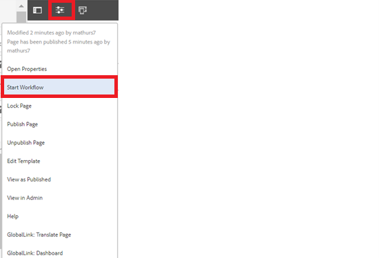
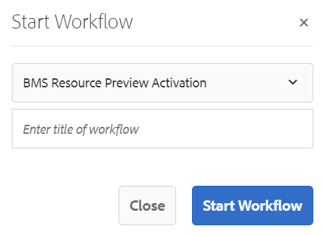
Step 7: After authoring all the fields, publish the page as shown below.
Article reading