
Step 1: Footer component needs to be configured on locale page.
Footer Component

Footer Component





The Footer Component, located at the bottom of the page, contains BMS standard signoff language.
Step 1: Footer component needs to be configured on locale page.
Step 2: Access the content tree from left navigation as shown, select the configure icon corresponding to the header component, and click on Configure icon.

Step 3: Two tabs in footer can be used to author footer component: Footer Tab and Footer Links Tab.
In Footer Tab there are Footer Logo, Footer Text, Copyright, and add More Logos field.
In Footer Links Tabs there is multifield, where 4 fields can be authored.


| Authoring Field | Description |
| Footer Logo | It is image authoring field; already uploaded image from dam can be dragged and dropped. Recommended Image Resolution - 200px x 30px |
| Footer Text | It is text authoring field to author text to be displayed on footer. |
| Copyright | Text field to author copyright text. |
| More Logos | On click of this button more items can be added. Recommended Image Resolution - 200px x 50px |

| Authoring Field | Description |
| Menu Link Title | This is text authoring field to author title for the link. |
| Link | This is path authoring field to author link path. |
| Aria Label | This is text authoring field to author Aria Label for link |
| Description | This is text authoring field to author description text. |
| Enabled flag | If this box is checked, checked link will be enabled in menus. |
To use custom footer to be rendered instead of footer component, Experience fragment need to be authored.
A experience fragment can be created by navigating to Navigation -> click on Experience fragment as shown in the below example.

Step2: Create experience fragment by clicking “create” in the respective folder and then select Experience Fragment

Step 3: Search and select the “BuildEasy Experience Fragment ” template from the available templates.

Step 3: Click on next and author the properties. Below is a reference. Next click on create

Step 4: Select the created experience fragment master click on edit and author components as required.

Step 5 To render ISI component authored in Experience fragment to page Navigate to locale page properties Build Easy Site Settings and author ISI Configurations. For more information Click Here
(Note : If user dont want ISI to render from locale page for specific Page and subsequent child pages navigate to required page properties and Override ISI. For more informantion Click Here)
Footer Variation V2
Four tabs in footer can be used to author footer component: Variation Tab, Column 1, Column 2, Column 3
In Variation Tab there are two dropdown ,Variation 1 and Variation 2
In Column 1 Tab there are Heading, Descriptiont, Site Link Label , Link , Disclaimer and Contact Info Heading fields.
In Column 2 Tabs there is Heading, and Other Information fields.
In Column 3 Tabs there is Advice Heading Label, Advice text, Follow Us Heading, Social Media Link, Social media Link Title, Legal Links multifield with two Link Text and Link fields ,Copyright Text, Copyright Link and PromoMat Text

| Authoring Field | Description |
| Variation | This is a dropdown fields with two values Variation 1 - If selected user will able to see Variation Tab, Footer Tab and Footer Links Tab Variation 2 - If selected user will able to see Variation Tab, Column 1 Tab, Column 2 Tab and Column 3 Tab |


| Authoring Field | Description |
| Heading | It is a text field and used to display the heading |
| Description | It is a text-area field and used to display the description |
| Site Link Label | It is a text field and used to display the site label |
| Link | It is a path field and used create a link for site link label |
| Disclaimer | It is a text area field and used to display the disclaimer |
| Contact Info Heading | It is a text field and used to display the contact info |

| Authoring Field | Description |
| Heading | It is a text field and used to display the heading |
| Other Information | It is a text area field and used to display the other information on footer |


| Authoring Field | Description |
| Advice Heading Label | Text field and used to display the headline |
| Advice text | Text area field and used to display the text |
| Follow Us Heading |
It is a text field and used to display the Follow Us Heading |
| Social Media Link | On click of follow us heading it will navigate to social media link. |
| Social media Link Title | It is a text field and used to display the title for social media |
| Legal Links | It is a multifield and has two fields Link Text and Link |
| Link Text | It is a text field and used to display the clickable text |
| Link | On click on it will redirect to authored link |
| Copyright Text | It is a text field and used to display the copyright text |
| Copyright Link | On click on it it will redirect to authored copyright link |
| PromoMat Text | It is a text field and used to display the PromoMat Text |
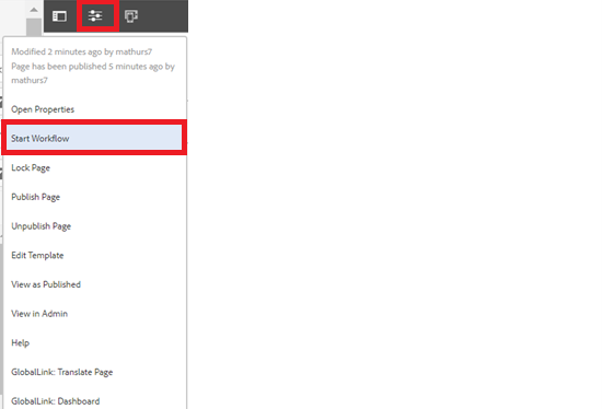
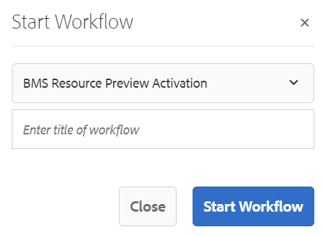
Step 4: After authoring all the fields, start workflow as shown below.
Desktop View:

Example: Footer V2 variation
