
Page Structure and Page Head Component





Page Head Excerpt Text
Anatomy of a Page
The structure of any page will always be the same, seen from top to bottom.
- Universal Navigation
The Universal Navigation, with BMS branding, is visible on the top of all pages. - Brand Logo & Main Navigation Bar
The row below contains from left to right the brand logo, the main navigation, the search bar, and, if supported by the site, the login. - Page head
Next comes the page head with the headline, image, excerpt, and button. - Content Area
The whole area between the page head and the footer we call the “content area." In this area the content can be managed with the help of components. - Footer
The page ends with the footer, which consists only of light branding, a legal message (if necessary), and mandatory links.
Page Head Component Variations
The page type determines the face of a page. The area below the main navigation and above the content area we call the "page head."
A page head consists of the page title, an excerpt, and an image or an area with a colored background and Banner button (optional, based upon requirement). For Banner button please follow below steps:
- Input the text that will serve as your Button text.
- Select the text, click on S Icon in Rich Text Tools, and select style as Banner Button.
- Add hyperlink over the text.
By default, Page Head component comes with Top Padding of 60px, which can be removed by ticking the checkbox "Remove Top Padding" in component Dialog.
Available Page Types
- Image first
A big image followed by the breadcrumb, the headline, and the excerpt. - Headline first
On top of the breadcrumb, followed by the headline and the excerpt, with the big image below. - No Image
The headline on top of a colored background, followed by the breadcrumb, and the excerpt. - Title Page
A big image in full width with the headline on top and the excerpt. A Title page does not have a breadcrumb. - Title(version 2)
A big image in full width with the headline on top and the excerpt. A Title page does not have a breadcrumb.
Authoring Dialog

Authoring Fields
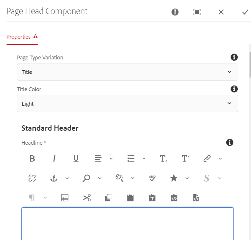
| Fields | Description |
| Properties | |
| Page Type Variation | This is a Dropdown field with different options, page type determines the face of a page
|
| Title Color | This is a dropdown filed with different options
|
| Standard Header | |
| Headline | This is a text authoring field to author the headline text |
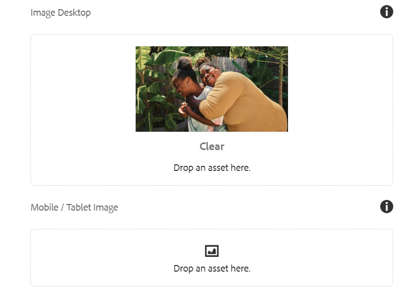
| Image Desktop | Image can be authored from dam that needs to be displayed for desktop |
| Mobile/Tablet Image | Image can be authored from dam that needs to be displayed for mobile |
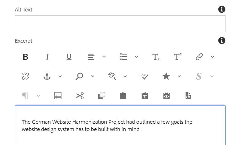
| Alt Text | It will be text authoring field to provide alternative text for the image |
| Excerpt | This is a text authoring field to author the excerpt text |
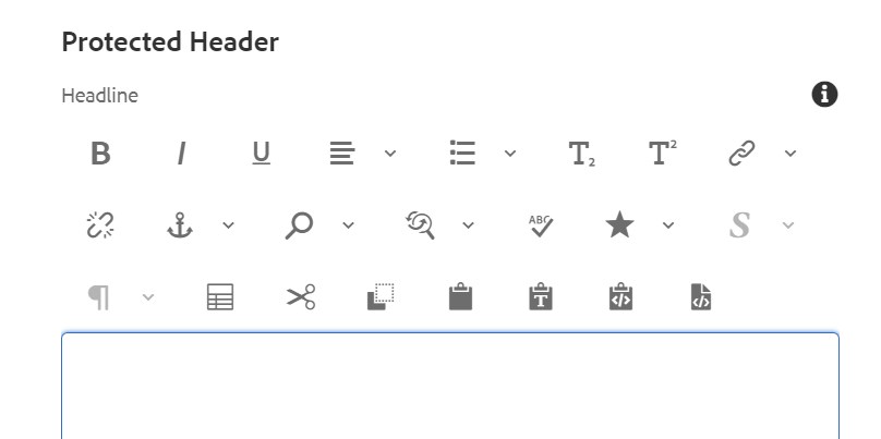
| Protected Header | |
| Headline | This is a text authoring field to author the headline text for protected content |
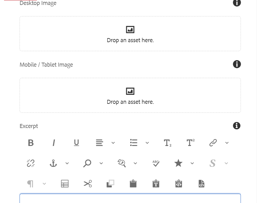
| Desktop Image | Image can be authored from dam that needs to be displayed for desktop |
| Mobile/Tablet Image | Image can be authored from dam that needs to be displayed for mobile |
| Excerpt | This is a text authoring field to author the excerpt text |
| Remove Top Padding | This is a checkbox field if enabled Top Padding of 60px will be removed. |
Authoring Dialog V2 Variation


Authoring Fields V2 Variation
| Fields | Description |
| Properties | |
| Page Type Variation | This is a Dropdown field with different options, page type determines the face of a page
|
| Standard Header | |
| Headline | This is a text authoring field to author the headline text |
| Image Desktop | Image can be authored from dam that needs to be displayed for desktop |
| Mobile/Tablet Image | Image can be authored from dam that needs to be displayed for mobile |
| Alt Text | It will be text authoring field to provide alternative text for the image |