
You can alter the properties of a locale page by clicking on the properties tab, as shown below.
Locale Page Properties

Locale Page Properties





You can alter the properties of a locale page by clicking on the properties tab, as shown below.

Additional Configuration


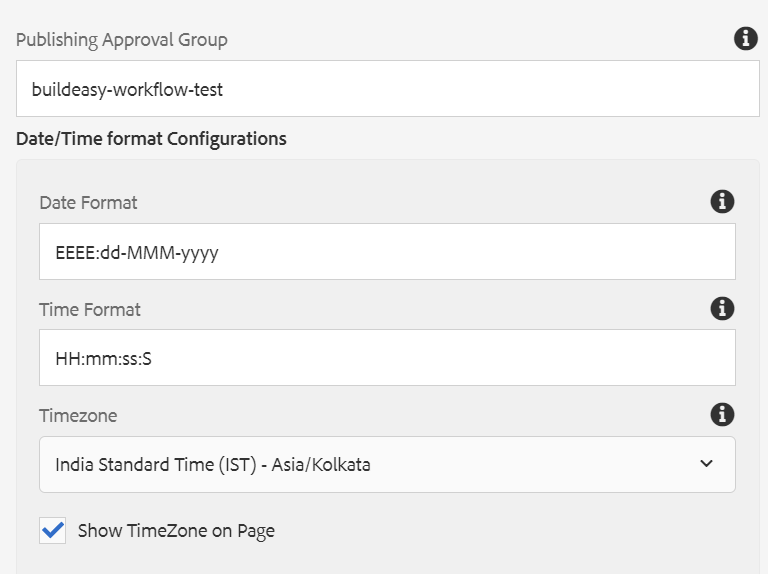


Additional configuration properties can be managed from here.
A favicon is a small icon or image that represents a website or web page. It is typically displayed in the browser's address bar, next to the page title, and in browser tabs.
They are important for branding and recognition, as they help users identify and differentiate websites in their browser tabs or bookmarks.
Entry Modal Section
Pulishing Approval Group
Data/TIme format Configurations
| Field name | Description |
| Note: All the below fields are read only fields, user can not modify the field content from locale page properties these properties are rendered from brand page properties. | |
| Analytics and others misc Head Scripts | |
| Analytics and others misc Head Scripts | Text authoring field, Authored script will be applied to head tag in Html |
| Analytics and others misc Head Scripts Preview | Text authoring field, Authored script will be applied to head tag in Html for preview sites(Note: If head script preview is not authored it will pick script from Analytics and others misc Head Scripts) |
| Interaction Studio Head Scripts | |
| Interaction Studio Head Scripts | Text authoring field to author scripts, these scripts will be provided by pub team as per the requirement. |
| Interaction Studio Head Scripts Preview | Text authoring field to author scripts for preview environment if not authored script will be pick from Interaction Studio Head Scripts |
| Chatbot Head Scripts | |
| Chatbot Head Scripts | Text authoring field to author scripts for chatbot integration, scripts authored will be rendered on chatbot screen based on the selected chatbot ID (Note: WE are dealing with two types of chatbots for now 1.ARM chatbot 2.HCP chatbot) |
| Chatbot Head Scripts Preview | Text authoring field to author scripts for chatbot integration for preview site if script not authored it will pick form chatbot headscripts |
| Qualtrics Head Scripts | |
| Qualtrics Head Scripts | Text authoring field to author scrips, These scripts will load feedback screen on page load/onclick of feedbackbutton/ onclick of html button on page these scripts will be provided by pub team as per the requirement. |
| Qualtrics Head Scripts Preview | Text authoring field to author scripts for preview environment if not authored it will pick from Qualtrics Head Scripts |
| Body Script | Text authoring field, Authored script will be applied to body tag in Html |
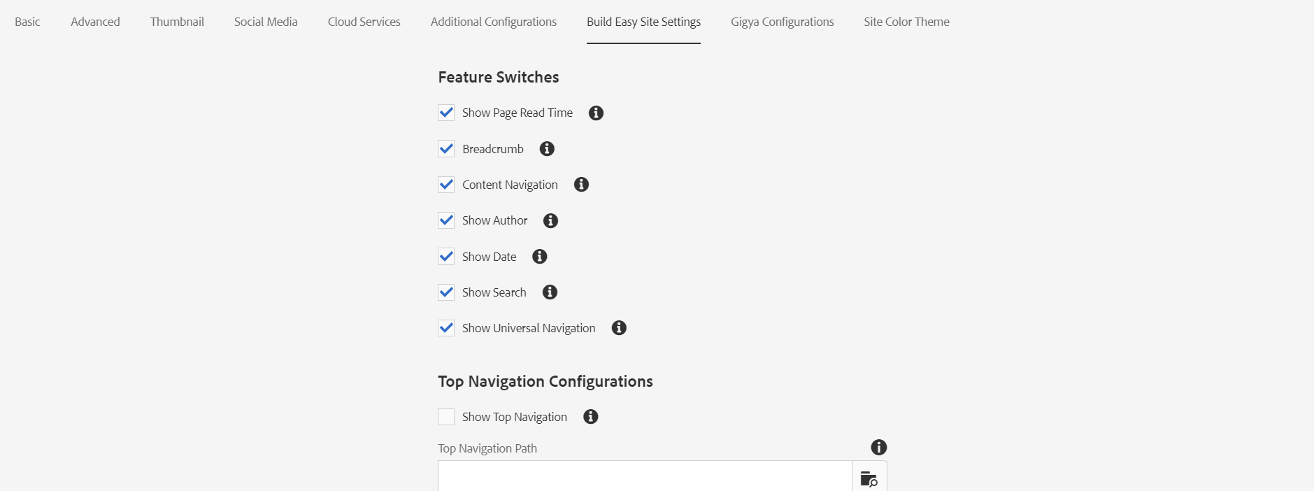


Back To Top Component

Feature Switches
Top Navigation Configuration
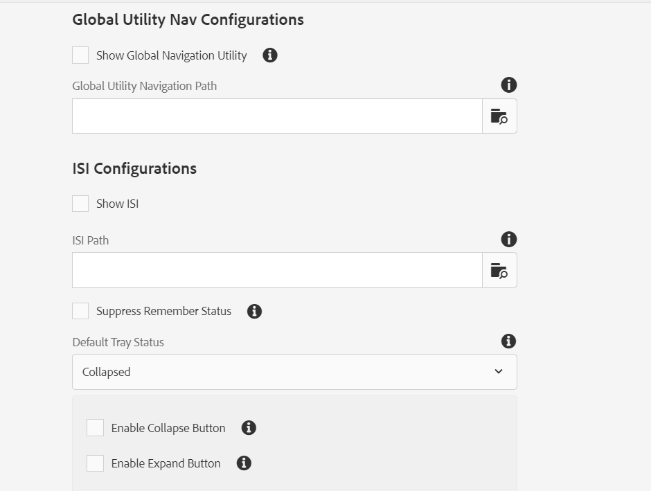
Global Utility Nav Configurations
ISI Configurations
Footer Configuration
Footnotes
Content Navigation
Hyphenation
Tooltip
Site Color Theme
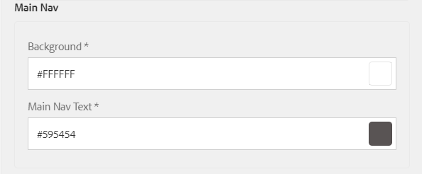
User can define 6 Scope Colors, By default, all the pages will follow Scope 1 Color Scheme, but the user can change the Color Scheme from General Page properties.


Base
Primary
Secondary
Gradient
Main Navigation
The components will have the site color applied based on the list below:
Hreflang Configurations

Domain
Language
Country
(Note: Dropdown fields are dynamically loading form genericlist Click here to refer how to create generic list example)
| S.No | Component Name | Description | Site color theme |
| 1 | Image Text | Heading/Title | Primary --> Default |
| Links | Base --> Links | ||
| Description Text | Base --> Text | ||
| ol and ul Bullet Points | Primary --> Default | ||
| Copyright background | Default rgba(246,243,243) | ||
| 2 | Footer | Footer Links | Base --> Text |
| Footer Links: on hover | Base --> Links | ||
| Text | Base --> Text | ||
| Copyright | Base --> Links | ||
| 3 | Large Image Gallery | Headings | Primary --> Default |
| Copyright background | Default rgba(255, 255, 255) | ||
| Description background | Default rgba(89, 84, 84) | ||
| Description Text for Image in Carousel | Primary --> Text on Primary Background | ||
| Copyright text / Description for Image | Base --> Text | ||
| Copyright text for Image in Carousel | Base --> Text | ||
| 4 | Highlight | Highlight Content | Base --> Text |
| Links | Base --> Links | ||
| 5 | Citation | Text | Base --> Text |
| Links | Base --> Links | ||
| 6 | Table Component | Table content | Base --> Text |
| Headings | Primary --> Default | ||
| Background | Default rgba(238, 231, 231) | ||
| Mobile View Borders | Primary --> Default | ||
| 7 | Link List | Headine -> links/Description | Base--> Headline |
| Links:On hover | Primary --> Default | ||
| Icon on hover | Primary --> Default | ||
| 8 | Links Recommendation | Headine -> links/Description | Base --> Text |
| Links on hover | Primary --> Default | ||
| Icon on hover | Primary --> Default | ||
| Icon background | Default rgba(166,159,159) | ||
| 9 | Download list | Title | Primary --> Default |
| Text | Base --> Text | ||
| Button | Primary --> Default | ||
| Button Text | Secondary --> Text on Secondary Background | ||
| Button on hover | Gradient Dark--> left | ||
| No image is authored | Gradient Dark -->right and left | ||
| 10 | Testimonials | Headings | Primary --> Default |
| Text | Base --> Text | ||
| links | Base --> Links | ||
| 11 | Conclusion Component | Primary Text | Primary --> Text on Primary Background |
| Primary links | Default rgba(210, 202, 200) | ||
| Primary links:hover | Secondary-->Default | ||
| Secondary Text | Base --> Text | ||
| Secondary links | Base --> Links | ||
| Secondary links:hover | Base --> Links | ||
| 12 | Accordion | Text | Base --> Text |
| Links | Base --> Links | ||
| Headings | Base --> Links | ||
| ol and ul tags | Base --> Links | ||
| 13 | Facts and Figures | Headings | Primary --> Default |
| Text | Base --> Text | ||
| Figures | Primary --> Default | ||
| Denotation Label | Primary --> Default | ||
| 15 | Call to Action | Floating and topline variation Text | Base --> Text |
| Floating and topline Primary button tet | Secondary --> Text on Secondary Background | ||
| Floating and topline Primary Button background | Primary --> Default | ||
| Floating and topline Headings | Primary --> Default | ||
| Floating and topline Secondary Button text | Base --> Text | ||
| Floating and topline Primary button : on hover | Gradient Dark--> left | ||
| Color variation Background | Gradient Dark -->right and left | ||
| Color variation Text | Primary --> Text on Primary Background | ||
| Color variation Button | Primary --> Text on Primary Background | ||
| Color variation Button Text Color | Primary --> Default | ||
| 15 | Main Navigation | Links | Primary--> Default |
| Menu Links: on hover | Primary--> Default | ||
| Title | Base --> Text | ||
| 16 | Search Component | Button Text Color | Primary --> Default |
| Button | Primary --> Text on Primary Background | ||
| Suggestions | Default rgba(246,243,243) | ||
| 17 | References - Foot Notes | Footnote Tooltip | Primary --> Default |
| Tooltip Text | Secondary-->Default | ||
| Popover Text | Default rgba(51, 51, 51) | ||
| Links | Base --> Links | ||
| 18 | Video Player | Modal Header | Primary --> Text on Primary Background |
| Video player icon | Base --> Links | ||
| Headings | Primary --> Default | ||
| 19 | Video Cards Component | Video player icon | Base --> Links |
| Headings | Primary --> Default | ||
| 20 | Content Utilities Component | Headings | Primary --> Default |
| Links | Base --> Links | ||
| Links: on hover | Base --> Links | ||
| 21 | Breadcrumb | Link Black | Default rgba(51, 51, 51) |
| Link Purple | Base --> Links | ||
| Active Link | Base --> Links | ||
| 22 | Page Head Component | Title Color | Base --> Links |
| Excerpt Text | Default rgb(51,51,51) | ||
| Secondary Heading | Secondary-->Default | ||
| Primary Heading | Primary --> Default | ||
| Dark Heading | Base --> Text | ||
| Light Heading | Primary -> Text on Primary Background | ||
| Dark Color Background | Default rgb(95, 21, 93) / Base --> Links | ||
| Light Color Background | Default rgb(242, 212, 241) / Base --> Links | ||
| 23 | Universal Component | Button Color | Base --> Links |
| Universal Nav Active Logo:hover | Base --> Links | ||
| Universal Border Bottom | Default rgb(238, 231, 231, 1) | ||
| Universal Nav Up Arrow | Default rgb(166, 159, 159, 1) | ||
| Universal Navigation Logo:hover | Default rgb(238, 231, 231, 1) | ||
| Universal 9 dots logo color | Default rgba(89, 84, 84, 1) | ||
| Universal navigation Background on click | rgb(49, 43, 43, 1) | ||
| Universal Nav active logo:hover | Default #b014ad | ||
| Universal Navigation Sublinks | Primary -->Text on Primary Background | ||
| Links/text | Secondary-->Text on Secondary Background | ||
| 24 | Search Results | Result title | Base --> Links |
| Heading | Base --> Links | ||
| Result Description | Default rgb(51,51,51) | ||
| Results border bottom | Primary-->Links on Primary Background | ||
| 25 | Secondary Navigation | Second Nav Link (active) | Base --> Links |
| Second Nav Links -- ipad/mobile (background) | Base --> Links | ||
| Second Nav Link | Default rgb(89, 84, 84, 1) | ||
| Second Nav Overlay background | Default rgb(49, 43, 43, .8) | ||
| Second Nav Title - open -- ipad(background) | Default rgb(238, 231, 231) | ||
| Second Nav Title Icon -- ipad | Default rgb(51,51,51) | ||
| Second Nav Title Open -- ipad/mobile(color) | Default rgb(51,51,51) | ||
| Second Nav Links -- ipad (background) | Primary -->Text on Primary Background | ||
| Second Nav Open -- ipad (background) | Primary-->Links on Primary Background | ||
| Second Nav Side Gradient Bar | Base --> Links / Primary -->Text on Primary Background | ||
| 26 | Cards Component | Cards Title | Base --> texts |
| Lock Icon | Base --> texts | ||
| Cards Meta Information Text Color | Base --> texts | ||
| Gradient Card Dark | Dark --> Right /Dark --> Left | ||
| Gradient Card Light | Light--> Right / Light-->Left | ||
| 27 | Link Warning | Progress Button Bg-color | Base --> Links |
| Modal Text | Default rgb(89, 84, 84, 1) | ||
| Cancel Button Color | Default rgb(89, 84, 84, 1) | ||
| Cancel Button Bordercolor | Default rgb(166, 159, 159, 1) | ||
| Cancel Button Bg-color | Secondary-->Links on Secondary Background |
Last updated: August 15, 2023